Art & Aesthetics: How to Look at a Painting
Looking at a painting doesn't require memorizing schools and dates first. It's more like learning the knack of "looking slowly"—your eyes knowing where to land, your mind knowing what it's feeling. Today, four keys: composition, light and color, brushwork, and the act of looking itself.
Composition & the Guided Eye
- Step back two or three paces and squint. Detail blurs away, and what you see first is the arrangement of large light-and-dark masses and shapes—the skeleton of "composition."
- Find the "visual center": the spot your eye lands on first. It's usually the brightest, the darkest, the most vivid, or where lines converge.
- Follow the "lines" in the picture: a figure's gaze, an outstretched arm, a road, a railing—they act like arrows, quietly dictating the order in which you look. Ask yourself: where does the painter want me to look first, then next?
- Notice whether the picture is "symmetrical and stable" or "tilted and uneasy." Horizontals and verticals reassure; a leaning diagonal brings movement and tension. This is the painter quietly working your emotions.
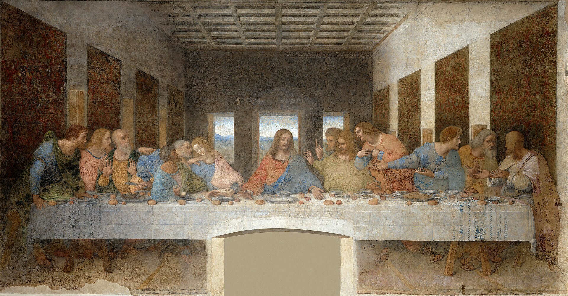
Leonardo da Vinci, The Last Supper: the perspective lines of the walls and ceiling all converge on the head of Christ at the center. Look once, and feel how your gaze gets "sucked" toward it.
Huang Gongwang, Dwelling in the Fuchun Mountains: this long handscroll has no single focal point. You "walk" slowly from right to left, following the mountains and water—a different kind of guidance.
Thinking composition just means "arranging things nicely." It's really more like a director's storyboard: it decides the order in which you look and the rhythm of the emotion. "Balanced" isn't always better—sometimes deliberate imbalance creates tension.
Find a high-resolution image of The Last Supper and trace the ceiling beams with your finger, feeling how they all converge onto Christ's face.
To ponder: In a photo you took recently, where does the visual center fall? Is it where you wanted it?
Light and Color
- First, look only at "where the light comes from": squint to find the brightest and darkest areas, and imagine a direction for the light. Light determines depth and drama.
- Then look at "warm versus cool": warm colors (red, yellow, orange) come forward, feeling near and lively; cool colors (blue, green, purple) recede, feeling distant and calm. Notice where the painter places the warm and hides the cool.
- Finally, feel the mood the "pairing" gives you: is it the harmony of neighboring colors, or the strong clash of complementaries? Color isn't just pretty—it speaks.
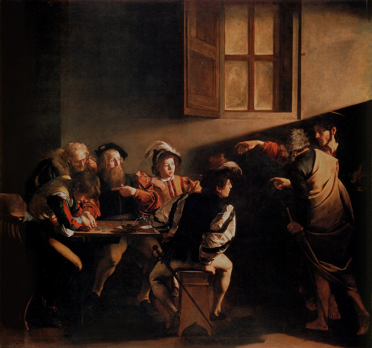
Caravaggio, The Calling of Saint Matthew: a slanting beam of light cuts into a dim room from the upper right, like a stage spotlight, instantly creating tension—this is called "chiaroscuro."
Wang Ximeng, A Thousand Li of Rivers and Mountains: layer upon layer of azurite and malachite green. See how the blue-green gives the mountains a jewel-like, tender luster.

Thinking "the more vivid the color, the better." Quite the opposite: masters often lay down large, restrained areas of gray, letting just one or two bright spots do the work—like a single sharp word in a quiet room carrying real weight. Another trap is treating color and light separately: the same patch of red is two different reds in sunlight versus in shadow, and what a painter paints is always "color that light has touched."
Look at a high-res image of The Calling of Saint Matthew and cover that slanting beam of light with your hand—the whole picture instantly goes flat. Cover and uncover it a few times to feel the weight of "light."
To ponder: The room you're in right now—is its light warm or cool? Does it make you feel relaxed, or alert?
Brushstroke and Texture
- Look up close (zoom in on a high-res image): in an oil painting, see whether the paint is laid flat or piled thick. The ridges left by thick application cast tiny shadows on the real canvas, giving a relief-like depth.
- See whether a stroke is "fast" or "slow": a fluid sweep is passion, is confidence; repeated reworking is restraint, is gravity. A brushstroke hides the speed of the painter's hand and the beat of their heart.
- In Chinese painting, watch for "ink in five tones": from one mass of black ink, more or less water yields dense, pale, dry, and wet—a single stroke holds layers.
- Then watch for the "magic of texture": the slip of silk, the chill of metal, the warmth of skin, the crust of bread—the painter is merely placing pigment on a flat surface, yet fools your fingertips. Hunt for these passages, and you'll marvel at how a smear of paint became "cloth."
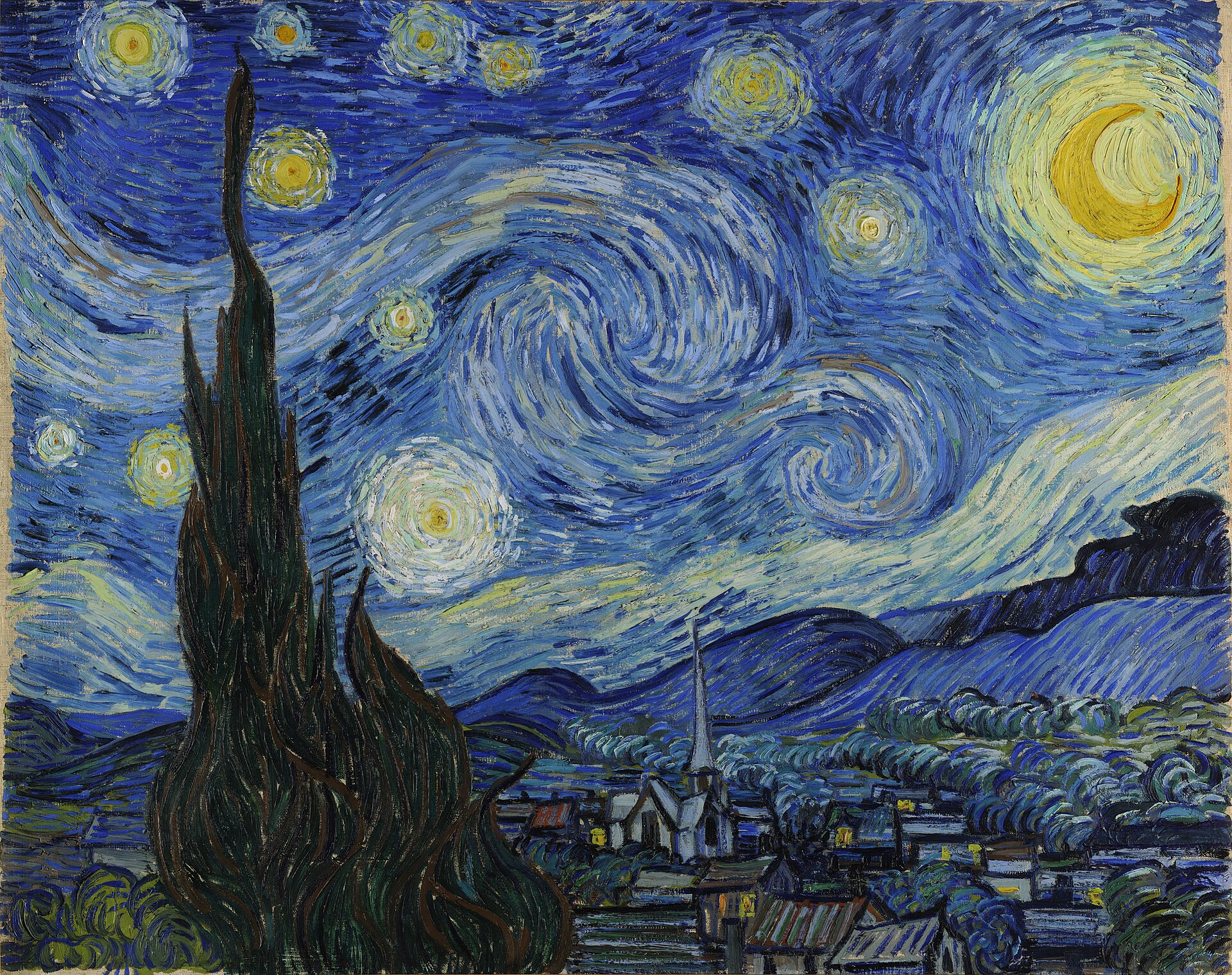
Van Gogh, The Starry Night: the sky is made of curling, churning ridges of thick paint. You can almost see the direction and force of his hand, as if he smeared the emotion straight onto the canvas.
The birds and flowers of Bada Shanren: a mere handful of strokes, and within the shades of ink a fish or a bird comes alive—see how "less" is actually harder.
Thinking the finer and more lifelike a painting is, the more valuable and "advanced" it must be. In fact, the loose, sketchy strokes of freehand painting often show greater mastery than meticulous detail—because they can't hide a single hesitation of the hand.
Zoom into a detail of The Starry Night until you can see the brushstrokes clearly, then zoom into any phone photo. The photo enlarges into mosaic pixels; the painting enlarges into the trace of a single human hand.
To ponder: How does your handwriting differ when you write fast versus slow? That, too, is a kind of brushstroke.
Ways of Seeing
- First see "what is painted" (describe it plainly), then ask "why was it painted this way": Who paid for it? Who was it for? What does the painter want you to believe? A painting is never just scenery.
- Remember that "seeing comes before words": before reading the label or the commentary, let your eyes sit honestly with it for thirty seconds and note your first feeling—calm, unease, or boredom? That feeling is real; don't rush to dismiss it.
- Beware the "halo of the masterpiece": when a painting is too famous, printed on mugs and ads, you may only be "recognizing it" rather than truly "seeing it." Try pretending you're seeing it for the first time.
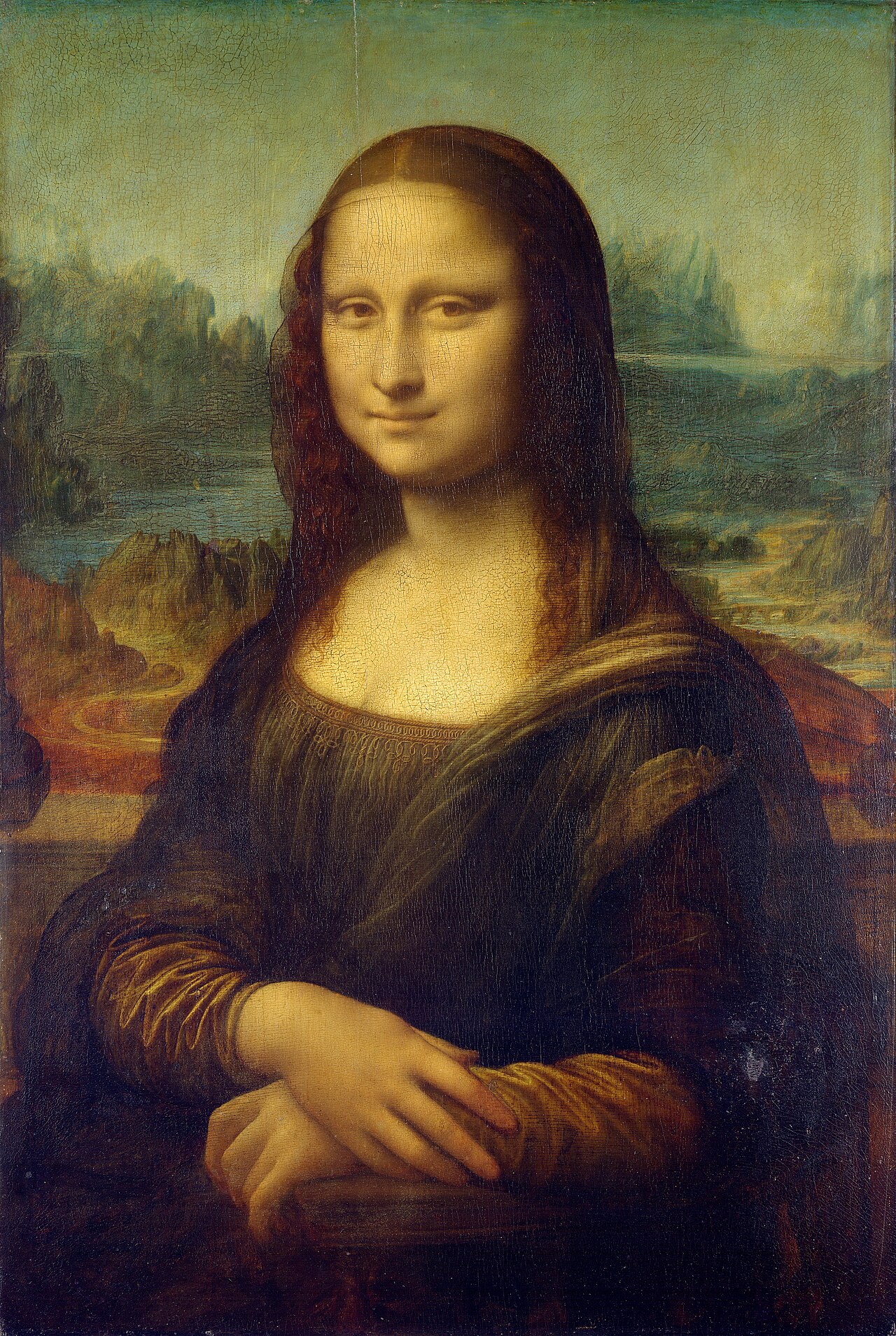
Leonardo da Vinci, Mona Lisa: set aside the label "world's most famous painting." Looking only at that half-smile and the hazy, receding background—what do you think she's thinking?
John Berger, Ways of Seeing (a 1972 TV series and book): he argued that reproductions change the meaning of the original, and advertising borrows the language of famous paintings—this slim book is a handy pair of "looking glasses."
Thinking "not getting it = being uncultured." Often it's the long-winded commentary that complicates a feeling that was simple to begin with. Honestly saying "I don't like it" is just as valid an aesthetic judgment. And admit it: some works really are difficult, and some reputations were built up bit by bit by their era and the market, not purely by the power of the work itself. Looking at art is a lifelong practice—feeling nothing today doesn't mean you never will.
Find a painting whose fame you've "long admired." Without reading any explanation, stare at it for thirty seconds and write down your first reaction; then read its backstory and compare the two ways of "seeing."
To ponder: Is there a universally acclaimed painting you actually don't like? Can you say why?