Art & Aesthetics: The Language of Color
Color is something we soak in every day yet rarely stop to think about. Putting on a red shirt can lift your spirits; stepping into a grey-blue room makes you lower your voice without noticing. Color is always quietly tugging at us—we just don't take it seriously. Today isn't about memorizing the color wheel; it's four things that matter more: why colors carry "emotion," what actually makes a good color scheme work, why the same color means opposite things in different cultures, and how a painter conjures a whole world from a handful of paints. Once you can read color, you'll look at paintings, pick clothes, and arrange a room with new eyes.
Color Psychology
- First feel the most basic pair: "warm" vs. "cool." Reds, oranges, and yellows are warm—they make an image "advance," come closer, feel lively. Blues, cyans, and greens are cool—they "recede," go quiet, hold their distance. Looking at a painting or a room, first ask: is it overall warm or cool? That one step already sets most of the mood.
- Notice how color acts on your body, not just the associations in your head. A large field of red makes you slightly tense, raises the heart rate; a wide expanse of blue relaxes and quiets you. You don't have to "get it"—your skin knows first.
- Then look at saturation and value: the same red, vivid and pure (a fire truck) versus dull and greyed (old brick), feels completely different—one flamboyant, one steady. A color's emotion lies seven-tenths in saturation and value, not just hue.
- Be honest: many "red = passion, blue = melancholy" pairings are learned through culture and experience, not innate law. So don't memorize formulas—feel what this one specific color does to you. That's the real thing.
Picasso's "Blue Period": young and destitute, he painted a series almost entirely in blue tones (e.g. The Old Guitarist, viewable on museum sites). What to look at: when a painting drains away nearly all warmth and leaves only cold blue, the poverty, loneliness, and chill hit you before you read a single caption—the tonality itself speaks for the figure. When a color is pure enough and large enough to fill your whole field of vision, it stops being "the color of something" and becomes emotion itself.
Thinking a color's emotion is a universal fixed formula you can just memorize. In fact the same color, with a different area, pairing, or culture, can mean wildly different things—it only has meaning within "who it's with, how much space it takes, who's looking."
Look at your own wardrobe: sort it into warm and cool piles. Which is bigger? Then think about which piece you reach for when you feel good and want to go out, and which when you're tired and want to hide. You've probably been using color to regulate yourself all along—you just never said it out loud.
To ponder: If a color's emotion is half innate and half learned, then when ads and brands hammer the same color at us again and again, are they "exploiting" your feeling—or "shaping" it?
Color Harmony
- Looking at a "nice" color scheme, first place it on the color wheel: arrange red, orange, yellow, green, blue, and purple in a ring, and the relationships between colors are hidden in their distance on that ring.
- Analogous colors (neighbors on the ring, like blue–cyan–green): naturally harmonious, calm, refined, because they're "one family." An outfit of blue, green, and grey rarely goes wrong—that's why.
- Complementary colors (directly opposite, like red & green, blue & orange, yellow & purple): placed together they "light each other up," with real punch. But large fields clashing head-on easily turn garish; the trick is use one in a large area and the other in a small one to enliven it—a patch of orange in a sea of blue, and it snaps awake.
- Remember one area rule: a good scheme is rarely "three colors each taking a third," but usually "one dominant color, one supporting, one small accent" (roughly 60 : 30 : 10). When a beginner's scheme looks messy, it's usually not the wrong colors—it's giving every color too much space.
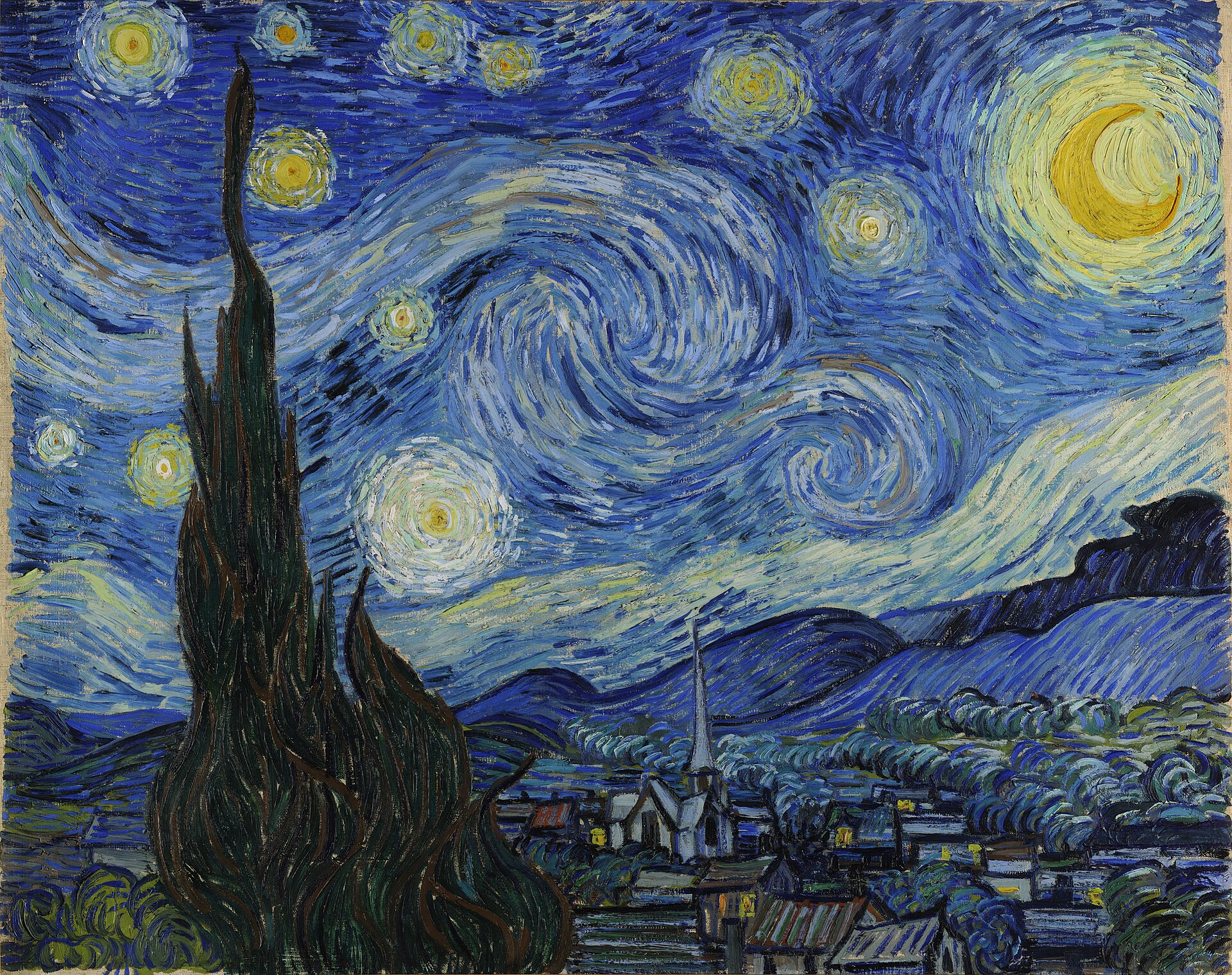
Complementary & analogous: Impressionist painters loved to slip complementary colors into shadows—a stroke of blue-violet beside a bright yellow wheat field, and the moment the two lock, the sunlight "brightens" (the next painting, The Starry Night, pushes blue-and-yellow to the extreme). China's blue-green landscapes take the other road: building gradations within a single color family—layered cyans and greens—winning not through contrast but through subtle variation within one family: a more understated kind of beauty.
Thinking "more colors = richer." Quite the opposite—masters subtract. A room, a poster, an outfit: once colors exceed three or four without a clear hierarchy, it instantly looks noisy and cheap. Restraint is the first skill of color.
Pick a photo or poster you find "really beautiful," count how many colors it actually uses, then judge which is dominant (taking the most space) and which is the accent (a small area for lift). You'll find the more refined the image, the fewer the colors and the clearer their roles.
To ponder: Why is "red with green" a byword for tacky in folk taste, yet in the hands of Monet and Van Gogh the secret to making a picture glow? With the same pair of colors, where does the difference lie?
Color in Culture
- Hold onto one myth-busting fact: the meaning of a color isn't innate, it's "agreed upon" by each culture. The same color, crossing a border or an era, can mean the exact opposite.
- Look at red: in China, red is festivity and good fortune—weddings, New Year, red envelopes, palace walls are all red. But in a Western context, red often points to danger and warning (stop signals, being "in the red"). The same red: on one side "throwing a celebration," on the other "hitting the brakes."
- Look at white: a Western bride wears white, symbolizing purity and the sacred; yet in East Asian tradition, white is the color of mourning (funerals, mourning dress). So before asking "is this color lucky," always ask first, "in whose culture?"
- Then look at blue-green (qing): in China it's tied to landscape and to "the realm" (jiangshan)—a solemn color that idealizes and eternalizes nature, utterly different in temperament from the realistic green of a Western landscape. To read a color, you must read the whole web of cultural imagination behind it.

The Forbidden City's red and yellow: the red walls and yellow tiles weren't chosen at random—yellow was the emperor's exclusive color in antiquity (imperial yellow), red signified nobility and joy. A set of colors is a whole hierarchy and worldview; here color is "institution." And in European classical painting, the Virgin's robe almost always used the most expensive ultramarine—the "costly" and the "holy" bound together: offering the most precious pigment to the most sacred figure was itself an act of faith.
Thinking a color "just is" lucky or unlucky, refined or cheap. In fact no color has an absolute good or bad, lucky or unlucky—it all depends on cultural context. Failing to read someone else's color scheme is often not a matter of taste, but of a different cultural code.
Notice the "color rules" around you: why do hospitals and banks favor blue and white? Why do sales and fast food love big red and yellow? Why do luxury brands stick to black, white, and gold? Pick three settings and ask what feeling they want to produce in you—color is forever "speaking" on someone's behalf.
To ponder: As global brands (red Coca-Cola, blue tech companies) make certain color meanings ever more uniform, are we gaining a "universal color language," or losing the rich layers each culture once held?
The Painter's Palette
- Looking at a painting, try a new exercise: guess how many paints the artist used in total. You'll often be surprised—a dazzling picture may have only five or six tubes on the palette. Richness comes from mixing and pairing, not from piling on pigments.
- Know an overlooked fact: paint used to be expensive. The famous ultramarine was ground from the gemstone lapis lazuli and once cost more than gold, so a large field of blue in an old painting was a mark of "luxury"—the history of color is also a history of materials and trade.
- Look at how painters "make light" through warm-cool relationships: juxtapose warm (the lit side) and cool (the shadow side), and the image instantly gains volume and luminosity—not by painting brighter, but by letting the contrast of warm and cool manufacture "light" for the eye.
- Conversely, look at the power of "less": some painters deliberately grey and soften their colors, veiling the whole picture in one muted tone (like Morandi's still lifes, the so-called "Morandi palette"). What to look at: the quiet, restrained, endlessly re-readable quality of low saturation and close values—loud is easy; this composed steadiness is the hard part.
Vermeer's blue and yellow: in Girl with a Pearl Earring, the ultramarine of the headscarf and the ochre-yellow of the jacket are exactly a warm-cool complementary pair. What to look at (view it in high resolution on the Mauritshuis website): he was willing to use the costliest ultramarine, letting that touch of blue glow quietly against the dark background. Many old masters used barely a dozen paints their whole lives yet painted all things—the same principle as music writing every joy and sorrow with just twelve notes.
Thinking more and brighter paints make a better painting. In fact limits often force out refinement: too many colors easily turn busy and messy; masters instead set their own limits—a few colors, building gradations through mixing and warm-cool relationships. Restraint is the real skill.
Find a high-resolution image of The Starry Night or any painting you love, fix your eyes on it for one minute, and just count colors: how many "big families" are there really? Which is the dominant tone? What cool color hides in the shadows? You'll find that reading a painting's color is far more interesting than memorizing its title or who painted it.
To ponder: Today's screens display tens of millions of colors, and paint is cheap and everywhere. When "color is no longer scarce," has our care and discernment for color grown—or shrunk?